Actualités
Rubens in Stuttgart
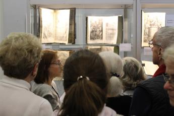
For 11 consecutive years, the Stuttgart antiquarian book fair has organised an exhibition.
Topics have ranged from antiquarian catalogues to important collectors or antiquarian booksellers, special publishers or collections to book illustrators. [See link here: http://www.stuttgarter-antiquariatsmesse.de/geschichte.html]

The exhibition organised by the Academy of Fine Arts and Design in Stuttgart for the 57th Stuttgart Book Fair of the German Association of Antiquarian Booksellers (Verband Deutscher Antiquare/VDA) aimed at showing the great variety of Rubens-books. While the catalogue listed all of Rubens's contributions to book design, the exhibition showed the various qualities of the books still extant, the various papers used for printing, the traces of censorship on the books, the bindings–in short, all that could not be shown in the comprehensive catalogue.
The collaboration between the Academy and the VDA began in 2017 for an exhibition on F.H. Ernst Schneidler, typographer and book illustrator and a teacher of typography at the Academy of Fine Arts and Design, whose work is seen as the basis for the so-called Stuttgart School of Typography. [Link: http://digi.ub.uni-heidelberg.de/diglit/buch_kunst_schrift2013] The VDA was very interested to showcase the work of this influential teacher and thus Angela Zieger, working on a doctoral thesis on Schneidler's artistic work, prepared an exhibition of Schneidler's typographical and book illustrative work with objects from the archives of the Academy together with Dr. Nils Büttner, professor of history of art and head of these archives. Their contribution is published in the biannual handbook of the VDA. [link: http://www.antiquare.de/150.html]
Nils Büttner, Rubens-expert and a bibliophile himself, and long since a collector of Rubens's books, was then asked to prepare another exhibition with the focus on Rubens's work for books. His collection and research and my research for a doctoral thesis on the subject constituted the groundwork for this exhibition.
The exhibition showed only original copies of the books and no reproductions. Because the German Antiquarians' Association's handbook is published biannually, the VDA was very interested in publishing a special catalogue for this exhibition, created by fellow art-historian and designer Anne-Kathrin Koch. [Link http://www.antiquare.de/eduard-moerike00.html]
Rubens and Book Illustrations
Peter Paul Rubens is well known for the many paintings that left his workshop in Antwerp in rapid succession. These paintings are found in collections all over the world today. Less well known is the fact that Rubens contributed many designs for title pages and book illustrations throughout his life.
Rubens had enjoyed a gentleman's education, learning both Latin and Greek in his youth, and was very interested in antiquarian matters. In the course of his life, he acquired an extensive library and his books were the basis for his learning and his artistic work. He was known as a pictor doctus, a learned painter. The books he adorned with either title pages or illustrations were influential works often by well-known authors, and often with more than one edition printed.
 The exhibition showed the whole breadth of his endeavours without it being possible to showcase every book, much less every edition with a Rubens design. Rubens began his career as a book illustrator with a series of illustrations for Balthasar Moretus's newly published Missale Romanum (1613; Cat. No. 3) and the Breviarium Romanum (1614; Cat. No. 5). The illustrations designed by Rubens and engraved by the Galle workshop were used repeatedly over the next century. The first part of our exhibition showed the various editions of the Missale to show the various formats and techniques of reproduction. For the plates were not only reworked over time, but also recut in smaller formats or even produced as woodcuts by Christoffel Jegher. An example for the latter is the Missale S. Monasteriensis Ecclesiae printed in Moretus's Officina Plantiniana in 1630. [Image: Christoffel Jegher after Peter Paul Rubens; illustration for Missale S. Monasteriensis Ecclesiae 1630. Private Archive.] Not only the illustrations for these liturgical works were reprinted in various formats; Rubens's designs for printer's marks, such as the one for Jan van Meurs, were also reproduced in various formats to accommodate to the book formats in which they were used (Cat. No. 57). Although engravings were much coveted forms of illustration, the woodcuts were cheaper to print as they did not need a second print with a roller press but could be printed together with the type.
 The widely used practice of using title pages for other works was illustrated by showing the corresponding title pages on the various books. A very good example for this practice are the Lyricorum Libri IV printed by Moretus in 1632 in quarto (Cat. No. 34). The title page was used five years later for Stephan Simonini's Silvae, thus providing Moretus with a cheap and fitting possibility of adorning this not very successful book with a title page. [Image: Cornelis Galle after Peter Paul Rubens; Stephan Simonini, Silvae Urbaniae, 1637. Private Archive.] Especially as it was dedicated to Pope Urban VIII. In 1634 Moretus decided to publish Sarbiewski's work (Cat. No. 35) in a much smaller format with a print run of 5000. Rubens again designed the title page, this time using a similar motive but adapted and reduced for the smaller format. Sometimes the plates were even sold with the books to other publishers who then used the images for their own means. Rubens's designs were, however, also copied more or less faithfully by engravers for publishers in other parts of Europe.
 Apart from showing these various practices of early modern publication, the exhibition also displayed the networks within which Rubens operated. Often, these networks were responsible for Rubens's contribution to the book publications. Just as his elder brother Philip, Peter Paul had been expected to become a lawyer or diplomat. Their father Jan Rubens was a learned jurist and a member of the Antwerp city council, thus firmly embedded in Antwerp's elite. His sons were expected to follow his lead. While Philip did indeed do so and studied both laws in Leuven and Rome, his brother Peter Paul became a painter. Both brothers shared an extensive antiquarian interest and so Peter Paul Rubens studied the ancient sculptures and architecture during his prolonged stay in Rome, while Philip studied ancient clothing and habits. For Philip's first publication, Electorum libri II (1608), Peter Paul then provided the illustrations (Cat. No. 1), just as drawings of his were used as illustrations for his son Albert's posthumous publication De re vestaria (1665; Cat. No. 55). A portrait by Rubens of his brother Philip was engraved by Cornelis Galle for a second, posthumous publication by Philip in 1615 (Cat. No. 7).
 The common interests by the Rubens brothers had even further implications: Peter Paul Rubens venerated the ancient philosopher Seneca as much as his brother's teacher, Justus Lipsius (1547–1606) who had published an extensive commentary on Seneca shortly before he died. Lipsius bequeathed his inevitable corrections to this commentary to his student Johannes Woverius (1574–1612), friend of the Rubens brothers and Moretus. Together they published a corrected edition in 1615 for which Rubens designed two illustrations engraved by Cornelis Galle (Cat. No. 8). The book thus provided a visual framework for the reader, introducing him to the content and, with a depiction of Seneca's death, attuning him to the proper mindset of neo-Stoic thinking. These two illustrations were also distributed as single sheets in an engraving by Lucas Vorsterman I. In 1637, Rubens provided a title page for the collected works of Lipsius (Cat. No. 45). [Image: Visual guidance into the commentary on Seneca by Lipsius. Private Archive.]
Many of the books for which Rubens provided designs were religious works, commentaries or tracts about religious matters, such as Giacomo Bosio's Crux triumphans (1617; Cat. No. 11), apart from the liturgical works already mentioned. The Society of Jesus was strongly present in Antwerp in the seventeenth century and Rubens was in contact with many of its very learned members. The Jesuits had already sponsored Rubens during his time in Rome, where he was commissioned to create altarpieces for this young order. One of the earliest books to which Rubens contributed illustrations was thus an illustrated propagandistic tract about the life of Ignatius of Loyola, the founder of the Society of Jesus: Vita Beati P. Ignatii Loiolae (1609; Cat. No. 2). But Rubens would provide designs for Jesuit authors throughout his life. Often his designs for title pages were not to the liking of its readers, many of whom faithful Jesuits for whose libraries many of the books were produced. Readers censored the naked bodies on some of Rubens's title pages, such as on this copy of Lessius's De iustitia et iure (1632; Cat. No. 12).
Rubens not only provided book illustrations and title pages for the religious networks in his hometown, but also for the political network of his country. He was, after all, a court artist. The biggest achievement of political propaganda is certainly his design for the Joyous Entry of the Cardinal-Infant Ferdinand of Spain and Portugal in 1635. A publication was planned in order to commemorate this political ritual in which the Netherlandish municipalities expressed their loyalty to the Spanish regent. Just as the entry itself, the book that was engraved by Theodoor van Thulden and had an extensive commentary by Rubens's friend Caspar Gevaerts, exceeds all expectations and is certainly one of the most lavish books of this genre (Cat. No. 51). Antwerp had invested the unbelievable sum of forty thousand guilders for the entry overall. Of the 600 copies of the Pompa Introitus Ferdinandi (1642), 200 were printed on Venetian paper, 400 on Lyonese paper, five on vellum and of these five three were hand-colored – one of which ended up in Madrid and is available in its digitized form [Link: http://bdh.bne.es/bnesearch/detalle/bdh0000051898].
Even though the latter book was an exclusive book, only available to a few, the other books with Rubens's title pages were often printed in many editions and with high print runs. Additionally, his assistants Erasmus Quellinus II and Abraham van Diepenbeeck had incorporated his way to design title pages into their own work, so that many of their designs were taken for a Rubens by the early Rubens-experts. Rubens and his assistants thus spread the allegorical imagery typical of Rubens into the whole wide world, visibly influencing later book artists and engravers and providing a lasting effect on book design.
About the author:
Gitta Bertram studies and teaches at the art-historical department of the Academy of Fine Arts and Design in Stuttgart (Germany). She studied History of Art, Art Education and Fine Arts at the Academy of Fine Arts in Stuttgart and English Language and Literature at the Universities of Tübingen and York.
In the attempt to merge her interests in the arts and in literature, she has been focusing on book illustrations. This led her to write about the book illustrations for Edmund Spenser’s Faerie Queene, photographic illustrations in WWI trench literature and the illustrations of F.H. Ernst Schneidler. Her specific background enables her to consider title-pages by Peter Paul Rubens from a different perspective, approaching the subject not only from an iconographic angle, but also from the material- and media-historical point of view in her forthcoming thesis on Rubens as a Designer.
Order the publication / German language:
>> Gitta Bertram und Nils Büttner: Sinnbild – Bildsinn. Rubens als Buchkünstler.
Verband Deutscher Antiquare e. V. und Staatliche Akademie der Bildenden Künste, Stuttgart 2018. 208 Seiten mit zahlreichen Abbildungen. Pappband.
ISBN: 978-3-9815734-5-9
• 30 € (plus shipping)